jordan
Loading preview…
Installation
terminal
terminal
terminal
terminal
Or, with @layro in your components.json:
terminal
Code
"use client"

/**
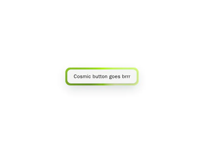
 * `border-beam` around `Button` — compact `beamSize="sm"` glow for controls.
 * `className` styles the button; `borderBeamClassName` styles the beam wrapper.
 */
import type { ComponentProps, CSSProperties } from "react"
import { forwardRef } from "react"
import {
  BorderBeam,
  type BorderBeamProps,
  type BorderBeamSize,
} from "border-beam"

import { cn } from "@/lib/utils"
import { Button } from "@/components/ui/button"

type BeamShellProps = Pick<
  BorderBeamProps,
  | "colorVariant"
  | "theme"
  | "staticColors"
  | "duration"
  | "active"
  | "borderRadius"
  | "brightness"
  | "saturation"
  | "hueRange"
  | "strength"
  | "onActivate"
  | "onDeactivate"
> & {
  beamSize?: BorderBeamSize
  borderBeamClassName?: string
  borderBeamStyle?: CSSProperties
}

export type BorderBeamButtonProps = ComponentProps<typeof Button> &
  BeamShellProps

export type BorderBeamIconButtonProps = BorderBeamButtonProps

export const BorderBeamButton = forwardRef<
  HTMLDivElement,
  BorderBeamButtonProps
>(function BorderBeamButton(
  {
    beamSize = "sm",
    borderBeamClassName,
    borderBeamStyle,
    theme = "auto",
    colorVariant,
    staticColors,
    duration,
    active,
    borderRadius,
    brightness,
    saturation,
    hueRange,
    strength,
    onActivate,
    onDeactivate,
    className,
    ...buttonProps
  },
  ref
) {
  return (
    <BorderBeam
      active={active}
      borderRadius={borderRadius}
      brightness={brightness}
      className={cn(
        "overflow-visible! inline-flex w-fit min-w-0 flex-col items-stretch leading-none",
        borderBeamClassName
      )}
      colorVariant={colorVariant}
      duration={duration}
      hueRange={hueRange}
      onActivate={onActivate}
      onDeactivate={onDeactivate}
      ref={ref}
      saturation={saturation}
      size={beamSize}
      staticColors={staticColors}
      strength={strength}
      style={borderBeamStyle}
      theme={theme}
    >
      <Button className={className} {...buttonProps} />
    </BorderBeam>
  )
})

BorderBeamButton.displayName = "BorderBeamButton"

export const BorderBeamIconButton = forwardRef<
  HTMLDivElement,
  BorderBeamIconButtonProps
>(function BorderBeamIconButton(
  { size = "icon-sm", className, ...props },
  ref
) {
  return (
    <BorderBeamButton
      className={cn("!leading-none [&_svg]:block [&_svg]:shrink-0", className)}
      ref={ref}
      size={size}
      {...props}
    />
  )
})

BorderBeamIconButton.displayName = "BorderBeamIconButton"
Versions
1.0.0 · current
Oct 30, 2026
First release.