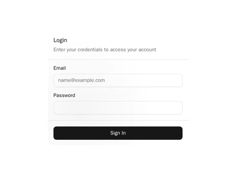
jordan
Loading preview…
Installation
terminal
terminal
terminal
terminal
Or, with @layro in your components.json:
terminal
Code
import * as React from "react"

import { cn } from "@/lib/utils"

const TextureCardStyled = React.forwardRef<
  HTMLDivElement,
  React.HTMLAttributes<HTMLDivElement> & { children?: React.ReactNode }
>(({ className, children, ...props }, ref) => (
  <div
    ref={ref}
    className={cn(
      "rounded-[24px] border border-white/60 dark:border-stone-950/60",
      "bg-gradient-to-b from-neutral-100 to-white/70 dark:from-neutral-800 dark:to-neutral-900",
      className
    )}
    {...props}
  >
    {/* Nested structure for aesthetic borders */}
    <div className="rounded-[23px] border border-black/10 dark:border-neutral-900/80">
      <div className="rounded-[22px] border border-white/50 dark:border-neutral-950">
        <div className="rounded-[21px] border border-neutral-950/20 dark:border-neutral-900/70">
          {/* Inner content wrapper */}
          <div className="w-full rounded-[20px] border border-white/50 text-neutral-500 dark:border-neutral-700/50">
            {children}
          </div>
        </div>
      </div>
    </div>
  </div>
))

// Allows for global css overrides and theme support - similar to shad cn
const TextureCard = React.forwardRef<
  HTMLDivElement,
  React.HTMLAttributes<HTMLDivElement> & { children?: React.ReactNode }
>(({ className, children, ...props }, ref) => {
  return (
    <div
      ref={ref}
      className={cn(
        "dark:border-border/30 rounded-lg border border-white/60",
        "rounded-[calc(var(--radius))]", // Base radius with fallback
        className
      )}
      {...props}
    >
      <div className="rounded-[calc(var(--radius)-1px)] border border-black/10 dark:border-neutral-900/80">
        <div className="rounded-[calc(var(--radius)-2px)] border border-white/50 dark:border-neutral-950">
          <div className="rounded-[calc(var(--radius)-3px)] border border-neutral-950/20 dark:border-neutral-900/70">
            <div className="from-card/70 to-secondary/50 w-full rounded-[calc(var(--radius)-4px)] border border-white/50 bg-gradient-to-b text-neutral-500 dark:border-neutral-700/50">
              {children}
            </div>
          </div>
        </div>
      </div>
    </div>
  )
})

TextureCard.displayName = "TextureCard"

const TextureCardHeader = React.forwardRef<
  HTMLDivElement,
  React.HTMLAttributes<HTMLDivElement>
>(({ className, ...props }, ref) => (
  <div
    ref={ref}
    className={cn(
      "first:pt-6 last:pb-6", // Adjust padding for first and last child
      className
    )}
    {...props}
  />
))
TextureCardHeader.displayName = "TextureCardHeader"

const TextureCardTitle = React.forwardRef<
  HTMLHeadingElement,
  React.HTMLAttributes<HTMLHeadingElement>
>(({ className, ...props }, ref) => (
  <h3
    ref={ref}
    className={cn(
      "pl-2 text-lg leading-tight font-semibold text-neutral-900 dark:text-neutral-100",
      className
    )}
    {...props}
  />
))
TextureCardTitle.displayName = "TextureCardTitle"

const TextureCardDescription = React.forwardRef<
  HTMLParagraphElement,
  React.HTMLAttributes<HTMLParagraphElement>
>(({ className, ...props }, ref) => (
  <p
    ref={ref}
    className={cn(
      "pl-2 text-sm text-neutral-600 dark:text-neutral-400",
      className
    )}
    {...props}
  />
))
TextureCardDescription.displayName = "TextureCardDescription"

const TextureCardContent = React.forwardRef<
  HTMLDivElement,
  React.HTMLAttributes<HTMLDivElement>
>(({ className, ...props }, ref) => (
  <div ref={ref} className={cn("px-6 py-4", className)} {...props} />
))
TextureCardContent.displayName = "TextureCardContent"

const TextureCardFooter = React.forwardRef<
  HTMLDivElement,
  React.HTMLAttributes<HTMLDivElement>
>(({ className, ...props }, ref) => (
  <div
    ref={ref}
    className={cn(
      "flex items-center justify-between gap-2 px-6 py-4",

      className
    )}
    {...props}
  />
))
TextureCardFooter.displayName = "TextureCardFooter"

const TextureSeparator = () => {
  return (
    <div className="border border-t-neutral-50 border-r-transparent border-b-neutral-300/50 border-l-transparent dark:border-t-neutral-950 dark:border-b-neutral-700/50" />
  )
}

export {
  TextureCard,
  TextureCardHeader,
  TextureCardStyled,
  TextureCardFooter,
  TextureCardTitle,
  TextureSeparator,
  TextureCardDescription,
  TextureCardContent,
}

export default TextureCard
Versions
1.0.0 · current
Oct 30, 2026
First release.