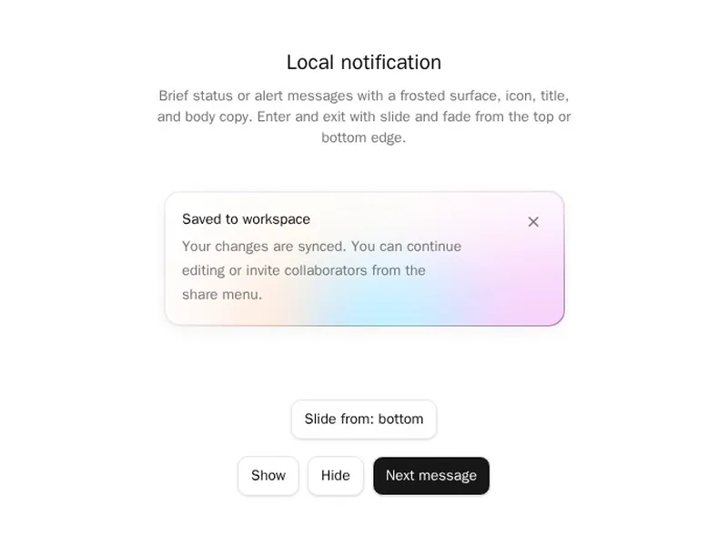
An alert should explain what happened and what to do about it, without shouting. Clear types, readable contrast and room for an action all matter here. Remember that colour alone can't carry the meaning, so look for icons and words too. Install one as code you own, then write messages that actually help people recover. Say what went wrong, then offer one clear fix.
Alerts are inline messages that tell people something happened: success, warning, error or information, often with an icon, a title and an action. Unlike toasts they stay in the page, next to what they're about.
Write the message as what happened and what to do next, in plain words. Use colour and an icon together so the meaning survives for colour blind readers, and announce important alerts to screen readers when they appear.
Frequently asked questions
An alert sits in the page next to what it's about and stays until it's no longer true. A toast appears briefly in a corner and disappears on its own, which suits confirmations like saved or copied.
Give important alerts role=alert, or put them in an aria-live region, so screen readers announce them when they appear. Pair colour with an icon and a clear title, so the meaning doesn't rely on colour.
Say what happened and what to do next, in plain words: what failed, why if you know, and the action that fixes it. Avoid codes and blame, and keep the person's input so they can try again.
Information that stays true, like a warning about an expired card, should stay until fixed. Messages that are only news, like a feature announcement, can have a close button that remembers the choice.
Build a bordered box with an icon, a title and a description, with variants for info, success, warning and error. Keep the colours from your theme so they work in light and dark.
An alert sits in the page and doesn't interrupt. An alert dialog stops people until they respond, so save it for decisions that need an answer, like confirming a deletion.
Yes. An icon makes the kind of message clear at a glance and helps people who can't tell the colours apart. Keep icons consistent for each type across the product.