Skip to content

Popovers for React and Tailwind

A popover holds what a tooltip can't: links, forms and small menus. It should stay attached to its trigger, keep clear of screen edges and close when you click away. Try each one near the side of the window, where weak ones fail. Install one as code you own and wrap it around any control that needs a little more.
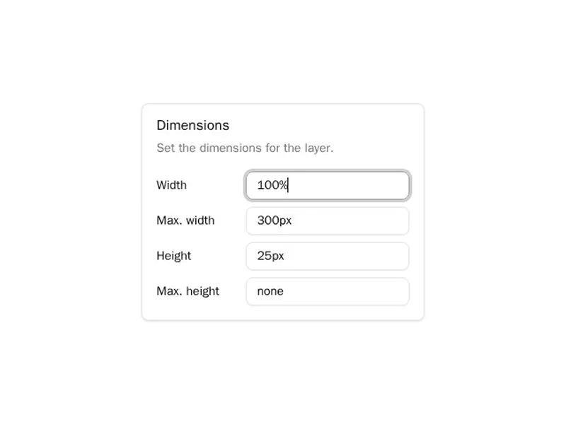
About popovers

Popovers are small floating panels anchored to the control that opened them. They hold more than a tooltip can, such as a short form, a colour picker, a list of options or a profile preview, and they stay open until people click away or press Escape.

Position them with a library that flips and shifts at the screen's edges, so they never open off screen. Move focus into the panel when it holds controls, return it to the trigger on close, and on phones consider a bottom sheet instead of a tiny floating box.

Frequently asked questions

A tooltip shows a short hint on hover or focus and holds no controls. A popover opens on click, can contain buttons, fields and links, and stays open until it is dismissed.

Use a positioning library such as Floating UI, or CSS anchor positioning where supported. Both let the panel flip to the other side and shift along the edge when there isn't room.

Yes. The popover attribute gives you top layer rendering, light dismiss and Escape handling for free. Pair it with anchor positioning or a small script to place it beside its trigger.

Yes, that's the expected behaviour, along with Escape. If it contains a form with input, consider keeping it open or asking first so nothing typed is lost.

Scale and fade it from the side nearest the trigger, so it appears to grow out of the control. Keep it fast, around one hundred and fifty milliseconds, and skip it for reduced motion.

A popover that opens after a short hover delay, often used for user or link previews. It shouldn't hold anything essential, since touch and keyboard users may never see it.

Small floating panels are hard to use with a thumb. Many apps switch to a bottom sheet on narrow screens, keeping the same content and actions.

Explore more