Skip to content

Checkboxes and Radios for React and Tailwind

Checkboxes and radio buttons look like small details until someone has to tap one on a phone. Look for a generous target, a clear checked state and labels that toggle them too. Indeterminate states matter if you have nested lists. Tab through each one to check its focus ring. Install one as code you own and use it across your forms.
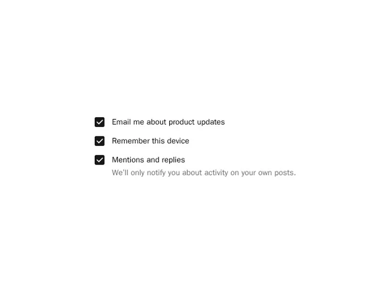
About checkboxes and radios

Checkboxes and radio buttons are the basic choices in a form. A checkbox turns one option on or off or picks several from a list, with an indeterminate state for partly selected groups, and a radio group picks exactly one from a set, sometimes styled as cards with a title and description.

Build on the native inputs so keyboard, form submission and screen readers work, then style around them. Make the whole label clickable, keep the target large enough for a thumb, and use radios when there are a few options to compare and a select when there are many.

Frequently asked questions

Keep a real input type checkbox, hide its default look with appearance none and draw your own box and check with CSS. The native element keeps focus, keyboard and form behaviour intact.

Use radios when exactly one option must be chosen from a set. Use checkboxes when any number can be chosen, or for a single yes or no setting.

A checkbox showing that some, but not all, items below it are selected. It's set from JavaScript and is common for select all controls in tables and lists.

Give each radio the same name, control the selected value from state and group them in a fieldset with a legend. Arrow keys should move between options.

Use a switch for a setting that takes effect at once, like turning on notifications. Use a checkbox for choices that are submitted with a form.

Wrap each option in a label styled as a card containing a hidden radio, its title and a description. Show the selected card with a clear border and keep the focus ring visible.

The box can be small, but the clickable area should be at least about 24 pixels, and larger on touch screens. Clicking the label should toggle it too.

Explore more