Skip to content

Animated Icons for React and Tailwind

An icon that moves when it is used tells people their click landed. These animate on hover, on press or when their state changes, like a menu that turns into a close mark or a heart that fills. Keep the motion short and let it settle, and respect reduced motion. Preview each icon live, then install it and use it wherever a plain icon felt flat.
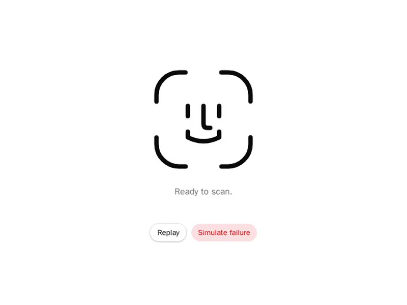
About animated icons

Animated icons move to show what just happened: a menu that turns into a cross, a heart that bursts when liked, a bell that rings, a check that draws itself, a copy icon that becomes a tick. They're built with SVG and CSS, Motion or Lottie and react to hover, click or state.

Animate to confirm an action or show a change of state, not for decoration. Keep each animation short, match stroke weights with the rest of your icons, give icon buttons accessible names and fall back to the static icon for reduced motion.

Frequently asked questions

Animate its paths with CSS transitions or a motion library, for example drawing a stroke with pathLength or morphing between two shapes on state change.

SVG with CSS or Motion is lighter and easier to recolour for small interface icons. Lottie suits complex illustrated animations exported from After Effects.

Wrap it in the button and trigger the animation on the button's hover and focus, so it plays for keyboard users too.

Animate the top and bottom lines into a cross by rotating them around the centre and fade out the middle line, all triggered by the menu's open state.

Usually between 150 and 400 milliseconds. Longer animations make the interface feel slow, especially for actions people repeat many times a day.

They should switch to an instant change or the static icon when people prefer reduced motion, checked with the prefers-reduced-motion media query.

Use currentColor for strokes and fills so the icon takes the text colour of its parent, and change that colour with CSS.

Explore more