Skip to content

Call to Action Sections for React and Tailwind

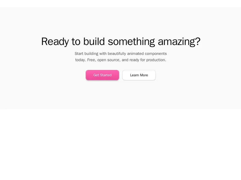
This is the section that asks for the click. By the time someone reaches it they have read enough, so the job is one clear line and one obvious next step. These closing blocks handle sign-ups, demo requests and downloads with enough presence to end a page properly. Preview them live, install one as code you own, and write the line that only your product could say.
About call to action sections

Call to action sections are the closing push on a page: a short headline, a line of support and one clear button, sometimes with a secondary link, an email field or a product image. They also appear mid page as banners that repeat the main offer once people have read enough.

One action per section works better than a row of choices. Write the button as what happens next, such as Start free, not Submit, keep the copy to a sentence or two, and give the section enough contrast to stand apart from the content around it.

Frequently asked questions

One clear action, a headline that restates the main benefit, a short line removing the last doubt and a button that says exactly what happens when it's clicked.

The result people get, in a few words, such as Start free trial or Book a demo. Avoid vague words like Submit or Click here.

One main action, repeated in the hero, after the key sections and at the end. A secondary action like View docs can sit beside it, styled more quietly.

For newsletters and waitlists, yes, since it removes a step. For sign ups that need more information, a button that leads to the form works better.

Give the section its own background or framing, leave space around the button and use your primary button style only there.

At the top, after the sections that build the case, and at the end. Place them where people have just been convinced, not in the middle of an argument.

Subtle motion can draw the eye once, such as a gentle reveal. Constant animation competes with the message and annoys people who are reading.

Explore more